Accessibility in Interactive Fiction: Letting Go of Gold
When I started this template, I didn’t start from scratch. I built on top of the default Inky web export template—Inky being the official editor for Ink. That template had a particular look: gold text on a white or black background. Warm, literary, kind of elegant.
I liked it. More than liked it—I was attached to it. It felt like a connection to where this project came from.
So when I started customizing the template, I kept the gold. I tweaked shades, adjusted here and there, but the gold stayed. It was part of the identity.
Then I learned about contrast ratios.
The WCAG accessibility guidelines say text needs a contrast ratio of at least 4.5:1 against its background to be readable for people with low vision. There are tools that check this. I ran my gold-on-white through one of them.
It failed. 2.58:1. The minimum is 4.5:1. Not even close.
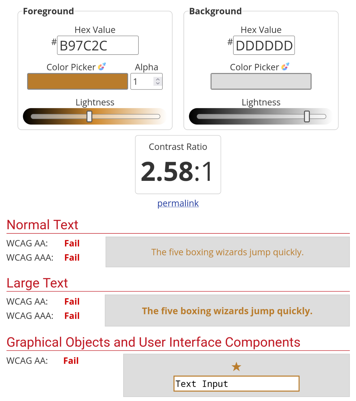
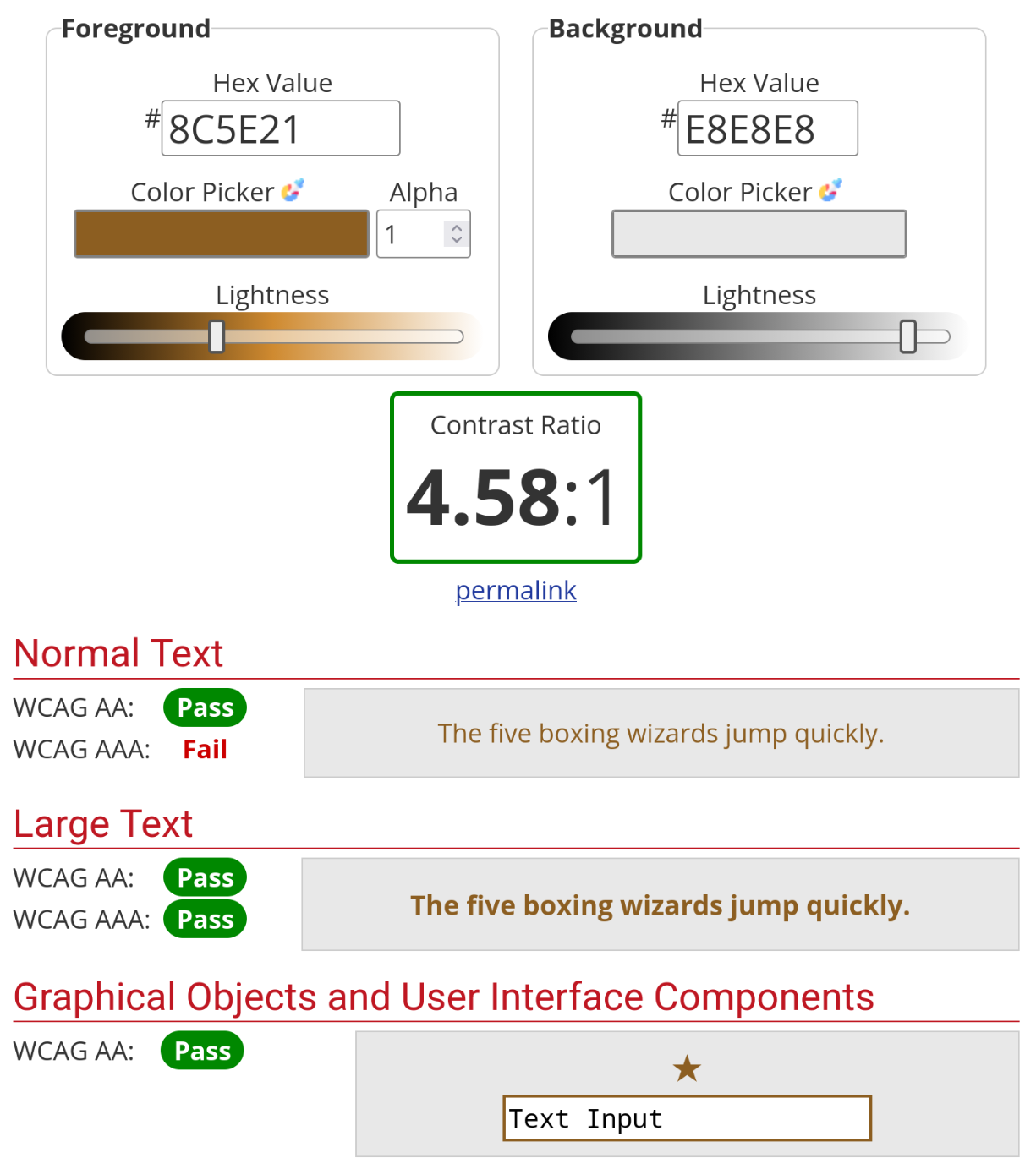
Okay, I thought, I’ll just find a darker gold. A more saturated gold. A gold that passes.
Here’s the thing about gold on white: the whole reason it looks soft and warm is because the contrast is low. That’s the aesthetic. A high-contrast gold isn’t gold anymore—it’s mustard, or brown, or orange. I tried a dozen variations. They all either failed the contrast check or looked terrible.
This is the best I could do and it is decidedly not gold…
I’m not good with colors. Never have been. Some people have an intuitive sense for palettes and harmonies; I just see “that looks okay” or “that looks wrong.” So I wasn’t exactly well-equipped for this fight.
Eventually I gave up. Stripped the color entirely. Made the template monochrome—black text on light backgrounds, white text on dark backgrounds. Simple. Readable. Boring, maybe, but functional.
It was the right call. I know that now. But it still stings a little, letting go of that gold.
| Before (Light) | After (Light) |
|---|---|
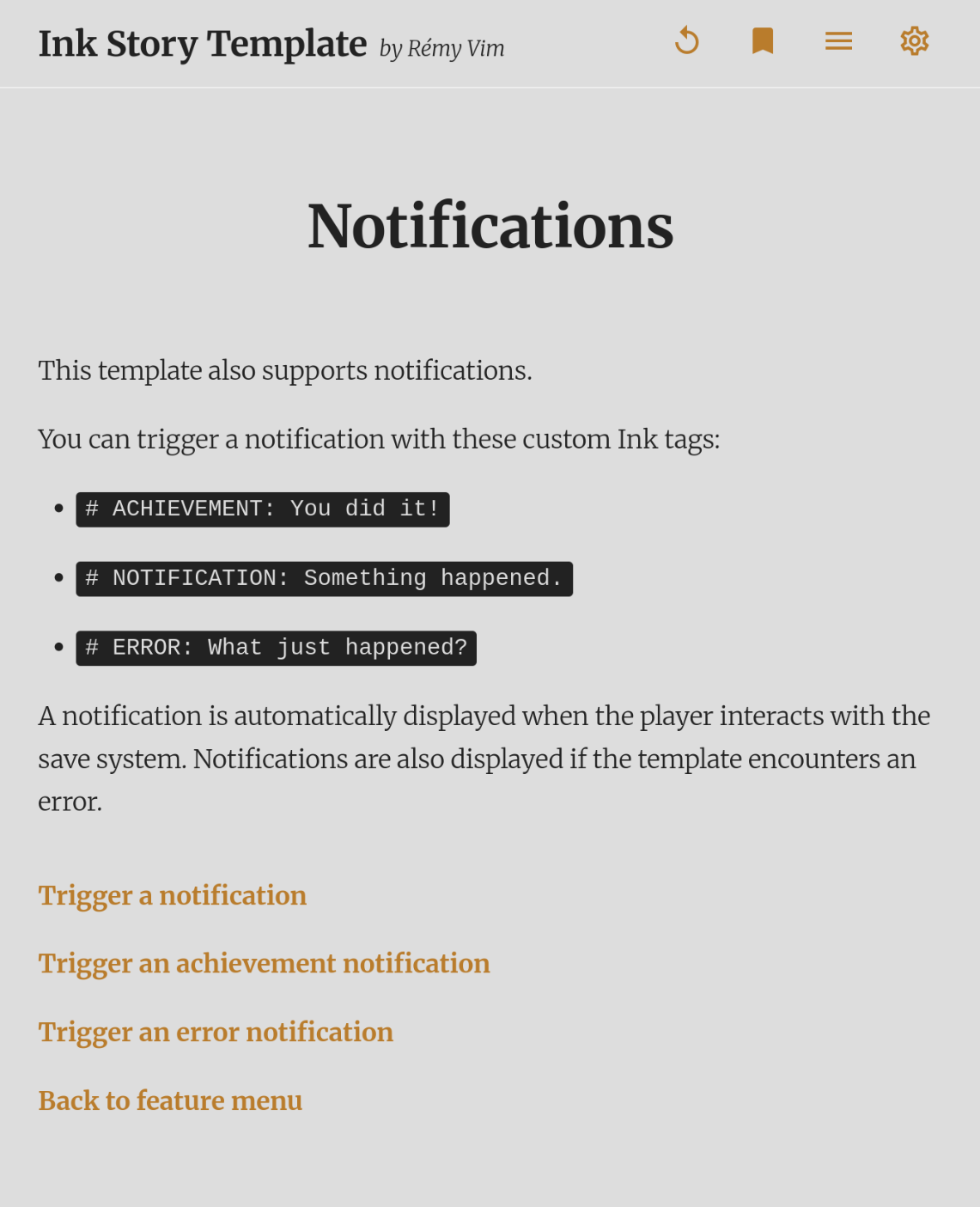 |
 |
| Before (Dark) | After (Dark) |
|---|---|
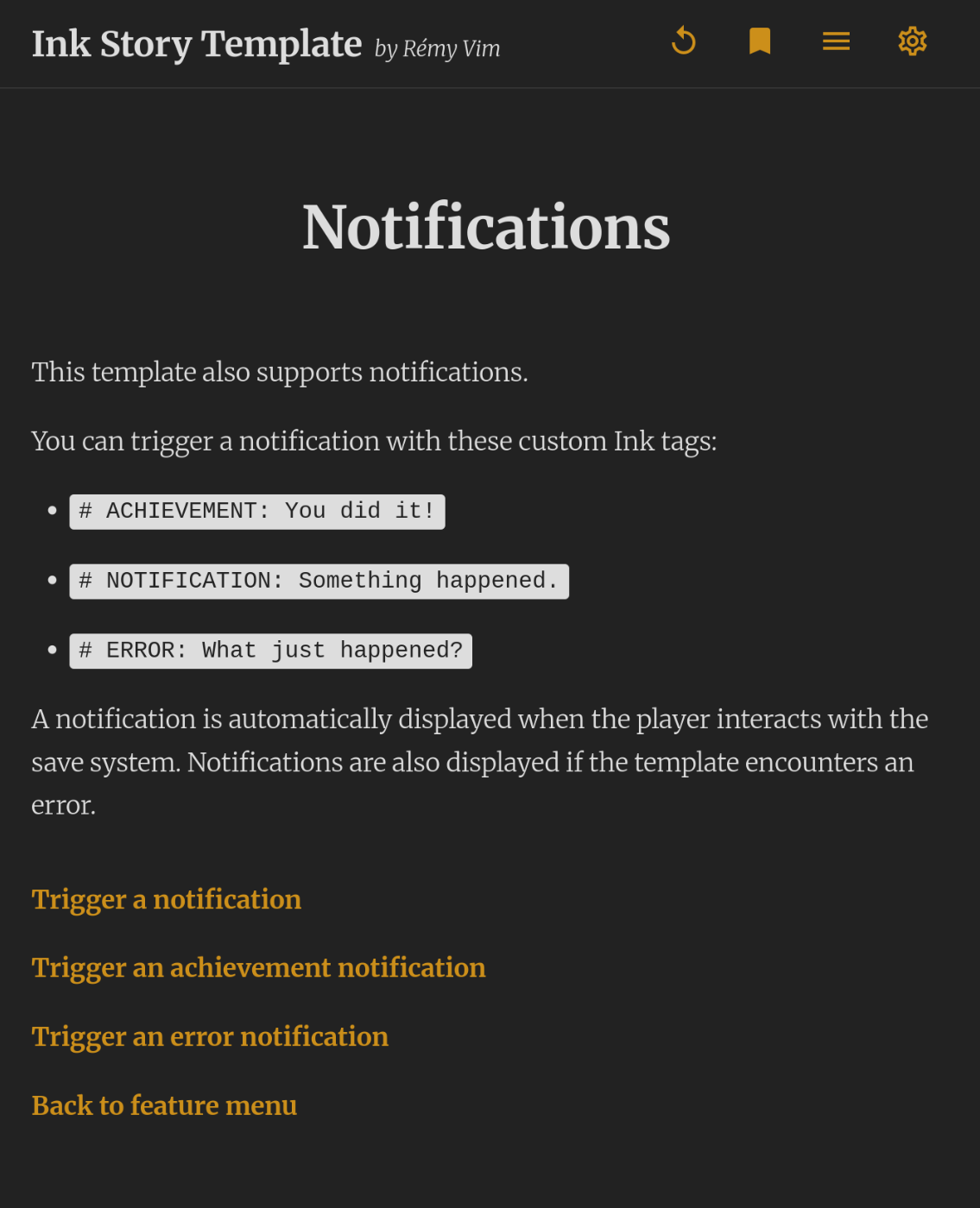 |
 |
I wanted the gold. I couldn’t have the gold. The template is better without it—not more beautiful, but more usable. And usable wins.
I guess that’s the tradeoff at the heart of accessibility work. You’re not just adding features; sometimes you’re killing your darlings. You’re accepting constraints. You’re choosing function over form when they conflict.
It doesn’t matter if it’s beautiful if people can’t read it.
(That said—if you’re reading this and you’re some kind of color wizard who knows how to make gold on white pass a 4.5:1 contrast ratio without looking like mustard, please write me. I will be both grateful and annoyed.)
If you want to add your own colors to the template via custom.css, you absolutely can—just run them through a contrast checker first. Learn from my mistakes.